
These Letraset books are probably the reason why I ever developed a fascination for type. The books were actually specimen catalogues for Letraset’s then state-of-the art rub-on lettering sheets my father needed for his work as an engineer. For me as a kid the actual rub-on letters were sacred. I loved to use the sample alphabets to retrace my own textlines on tracing paper.
In the early Nineties, long before my decision to study graphic design, I created a handful of experimental pixel fonts on the Commodore 64. So much for my early flirts with type design.
I got my Diploma at the Meisterklasse at Die Graphische in Vienna and worked for various agencies until I started as a freelance art director at Büro Perndl. At that time I had first serious typefaces in the works.
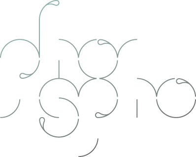
Phospho type foundry started in 2008 with the release of Adhesive Nr. Seven. Since then I finished approximately one typeface per year and consider myself as 50% graphic designer, 50% type designer. The remaining part I try to spend for my passion project Stadtschrift, an association for the collection, preservation and documentation of historic façade signs. We save unique signs from being scrapped and put them on display in the public again. So there is a big love for ancient shop signage and their typefaces, and the inspiration I draw from the heritage of the city makes phospho a heartfelt Viennese foundry.
Work published in
31./32./33./34. Annual des CCA
Freiraum, Die Presse 02/2014
grafik.net Letterform
habitat Magazine September/October 2016
Logology®2 The Wonderland of Logo Design (Victionary)
LosLogos 5 & 6 (Gestalten Verlag)
Monocle July/August 2016
MyFonts Rising Stars 07/2009, 03/2015
Novum 10/2009, 10/2013
PAGE 12/2014, 08/2016
red dot yearbook communication design 2012
Slanted Magazine #10
strukt magazine #2
Typodarium 2010, 2012, 2013, 2016, 2018 (Verlag Hermann Schmidt Mainz)
Typografische Interferenzen (Zürich/Vienna)
Typographica.org – Favourite Typefaces of 2015
Typographica.org – Favourite Typefaces of 2018